SSENSE
Design Challenge
Industry leading force in luxury fashion editorial and cultural commentary as one of the most recognizable e-commerce platforms worldwide.
SSENSE currently employs close to 500 full-time staff, achieves approximately 32 million page views per month, and has had 82 percent compound annual sales growth since its first year.
The majority of its revenue from luxury brands such as Valentino, Balmain, Yves Saint Laurent, Givenchy, Comme des Garçons, and Vêtements but the platform is also said to be operating outside the confines of the traditional fashion sphere with unconventional buys, strong connections to art, music and creativity, and a sophisticated blurring of streetwear and high fashion.
As a part of my design challenge, I was asked to
tell a better story and route visitors to various parts of our catalog in a radical, intuitive and personalized way. To design a shop homepage in a way that is intuitive, scalable, mobile-friendly and beautiful.
For full access to the case study (Desktop, Personas, Experience Journey Map, Sketches, Documentation and full animated prototype):
Available Upon Request ︎
My Role:
Research & Strategy
Wireframing
User Testing
Prototyping
Micro Animation
Tools:
Sketch
InVision
Protopie
Photoshop
Platform:
Desktop & Mobile
Timeframe:
5 days
Research & Strategy
Wireframing
User Testing
Prototyping
Micro Animation
Tools:
Sketch
InVision
Protopie
Photoshop
Platform:
Desktop & Mobile
Timeframe:
5 days
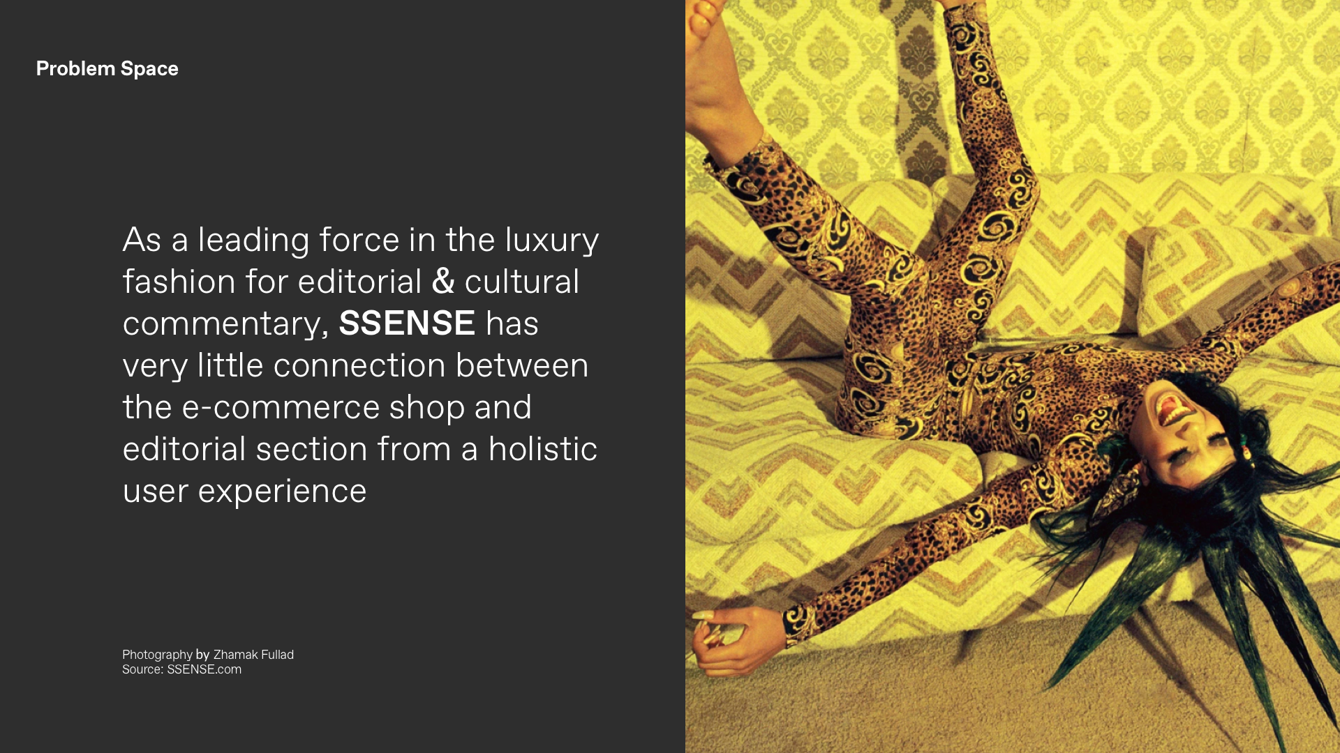
Problem Space
Starting with initial research of the current problem space regarding the brief’s objectives:
Starting with initial research of the current problem space regarding the brief’s objectives:
As a leading force in the luxury fashion for editorial & cultural commentary, SSENSE has very little connection between the e-commerce shop and editorial section from a holistic user experience
KPI’s
As outlined in the brief’s deliverables, two fundamental KPI’s were addressed for the homepage:
- Engagement on the page
- Bounce rate (visitor is able to find interesting content easily/quickly)
As outlined in the brief’s deliverables, two fundamental KPI’s were addressed for the homepage:
- Engagement on the page
- Bounce rate (visitor is able to find interesting content easily/quickly)
Why Identify This Problem Space?
• 2018: 29% of revenue is generated via SSENSE’s readers
• 2016:Consumers who click through editorial content spend 7 per cent more on their orders and return to the site 300 per cent more often than those who don't.
• To increase engagement to other parts of the catalogue.
• 2018: 29% of revenue is generated via SSENSE’s readers
• 2016:Consumers who click through editorial content spend 7 per cent more on their orders and return to the site 300 per cent more often than those who don't.
• To increase engagement to other parts of the catalogue.
Project Objective
The project objective’s task is to help SSENSE tell a better story and route visitors to various parts of our catalog in a radical, intuitive and personalized way. The ask was to design a shop homepage in a way that is intuitive, scalable, mobile-friendly and beautiful. How can we increase engagement in various parts of the vast SSENSE catalog?
The project objective’s task is to help SSENSE tell a better story and route visitors to various parts of our catalog in a radical, intuitive and personalized way. The ask was to design a shop homepage in a way that is intuitive, scalable, mobile-friendly and beautiful. How can we increase engagement in various parts of the vast SSENSE catalog?
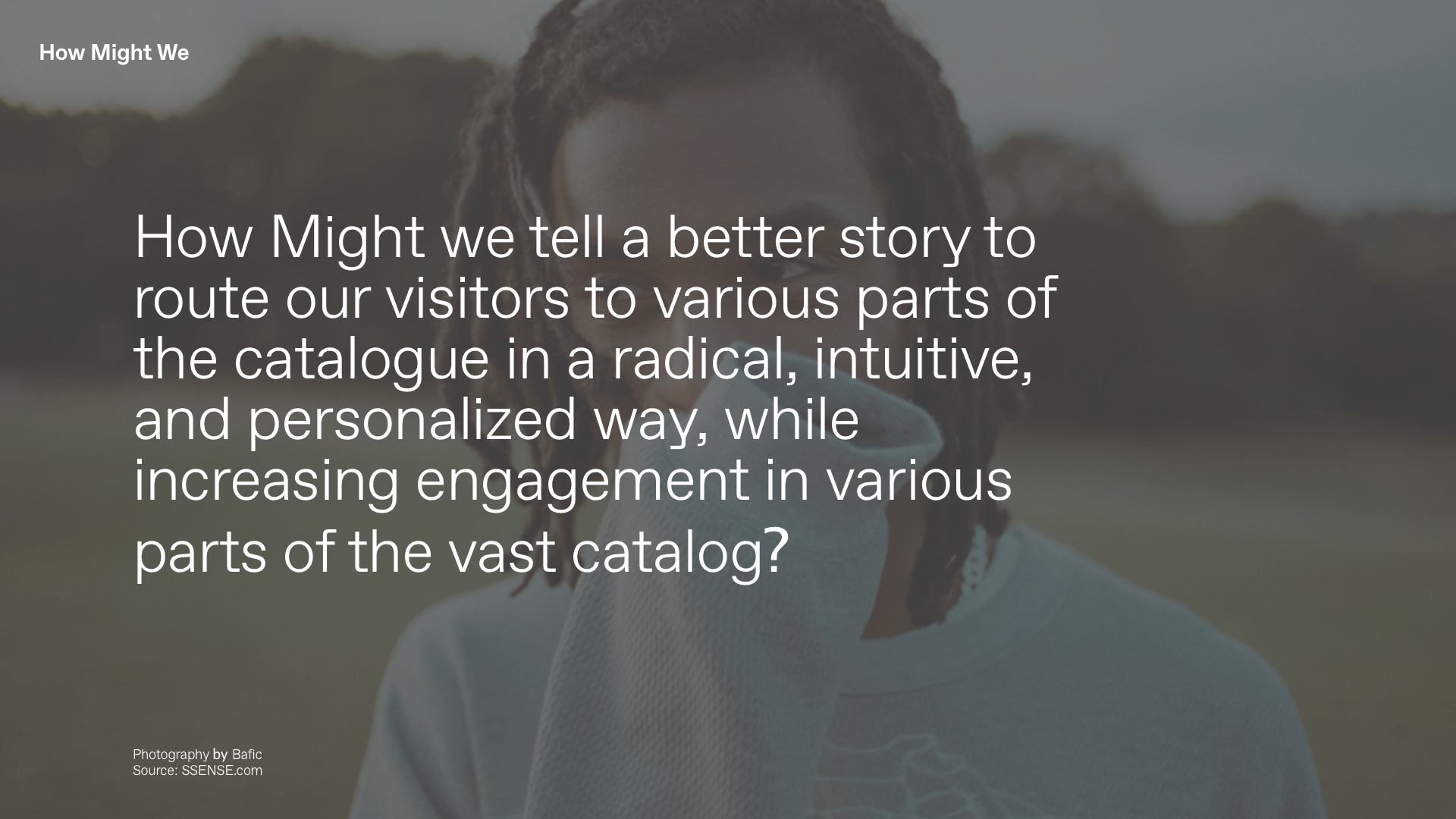
How Might We
tell a better story to guide our visitors to various parts of the catalogue in a radical, intuitive, and personalized way, while increasing engagement in various parts of the vast catalog?
Hypothesis
I believe designing a homepage to bind a stronger connection between editorial and retail experiences, will help users to discover various parts of the SSENSE catalogue. I know this is true if their engagement (quantitative) on the site increases and reaction of their bounce rate (qualitative).
I believe designing a homepage to bind a stronger connection between editorial and retail experiences, will help users to discover various parts of the SSENSE catalogue. I know this is true if their engagement (quantitative) on the site increases and reaction of their bounce rate (qualitative).
Synthesis
Interviews were conducted in order to measure both qualitative & quantitative feedback:
Interviews were conducted in order to measure both qualitative & quantitative feedback:
By conducting an a single round of interviews with two different users 1) New User 2) Re-Occurring User, I was then able to extract their experiences into Pain Points, Motivations, and Behaviours.
From there pulling key insights from the current state of the landing page experience
Key Insights
1. Discovery
Users finds Inspiration through editorial content & look books
2. Personalization
Users want more personalization recommendations of products & content
1. Discovery
Users finds Inspiration through editorial content & look books
2. Personalization
Users want more personalization recommendations of products & content
3. Continuity
Disconnection between the relationship of products in the editorial and retail experience
Disconnection between the relationship of products in the editorial and retail experience
Primary Persona
With the information gathered through the interviews, a primary (Janet) & secondary (Melanie) Persona were assembled to help plan and drive design decisions.
With the information gathered through the interviews, a primary (Janet) & secondary (Melanie) Persona were assembled to help plan and drive design decisions.
Experience Map
Janet’s experience buying clothes online from an unfamiliar brand is visualized below. Looking through the lens of her experience begins from the closet and ends with returning an item that does not size her correctly. A set of stages of doing, feelings, moods, thoughts, channels and touch points are displayed to provide a full understanding, and how we can empathize with the experience.
Janet’s experience buying clothes online from an unfamiliar brand is visualized below. Looking through the lens of her experience begins from the closet and ends with returning an item that does not size her correctly. A set of stages of doing, feelings, moods, thoughts, channels and touch points are displayed to provide a full understanding, and how we can empathize with the experience.
Opportunities of intervention:
1) Recommendations of items searched or related items with the same fitting
2) The ability for users to input their measurements to help match sizes from previous purchases
3) Providing her tools and detailed information of how items fit, to make better sizing decisions
4) The ability to compare measurement sizes with other customers or models
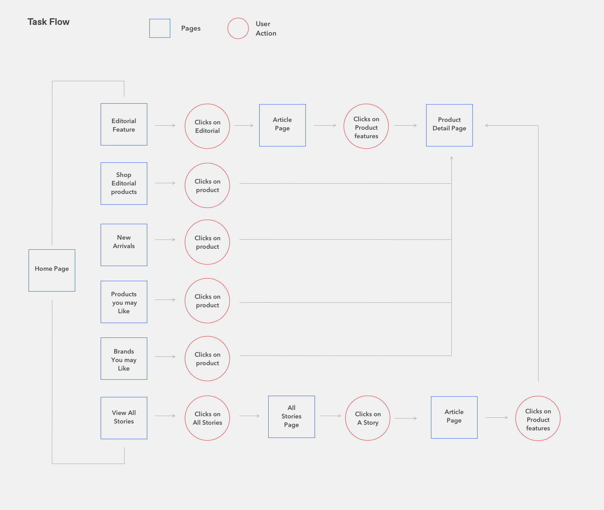
Task Flow & Epics
In order to form a comprehensive narrative the following user stories were merged to form the core epic of a returning customer seeking inspiration and personalization from a vast catalog. The application of the core epic was then illustrated into a task flow, providing a framework for the wireframes and prototype
In order to form a comprehensive narrative the following user stories were merged to form the core epic of a returning customer seeking inspiration and personalization from a vast catalog. The application of the core epic was then illustrated into a task flow, providing a framework for the wireframes and prototype

UI Testing
Two rounds of testing were conducted with 1 users for each session with hi-fidelity wireframes and the final layouts.
Two rounds of testing were conducted with 1 users for each session with hi-fidelity wireframes and the final layouts.
All tasks were successful for the 1st user. Two tasks were were unsuccessful when tested on a new-user. The user had difficulty tiring the relationship between an editorial products be related to the article. Navigation felt overwhelming to the user on the second round of testing. Personalized messaging was revised to “Brands you may like,” removing any redundancy.
Prototypes & Iterations
Mid-fidelity and hi-fidelity wireframes were prototyped with Invision for Desktop & Mobile Final layouts were prototyped in protopie for only mobile.
The last two images show stages of iterations from UI testing and feedback
Mid-fidelity and hi-fidelity wireframes were prototyped with Invision for Desktop & Mobile Final layouts were prototyped in protopie for only mobile.
The last two images show stages of iterations from UI testing and feedback
Invision Prototypes
Mid Fidelity
Hi Fidelity
Final Prototypes (1st submission)
Mid Fidelity
Hi Fidelity
Final Prototypes (1st submission)
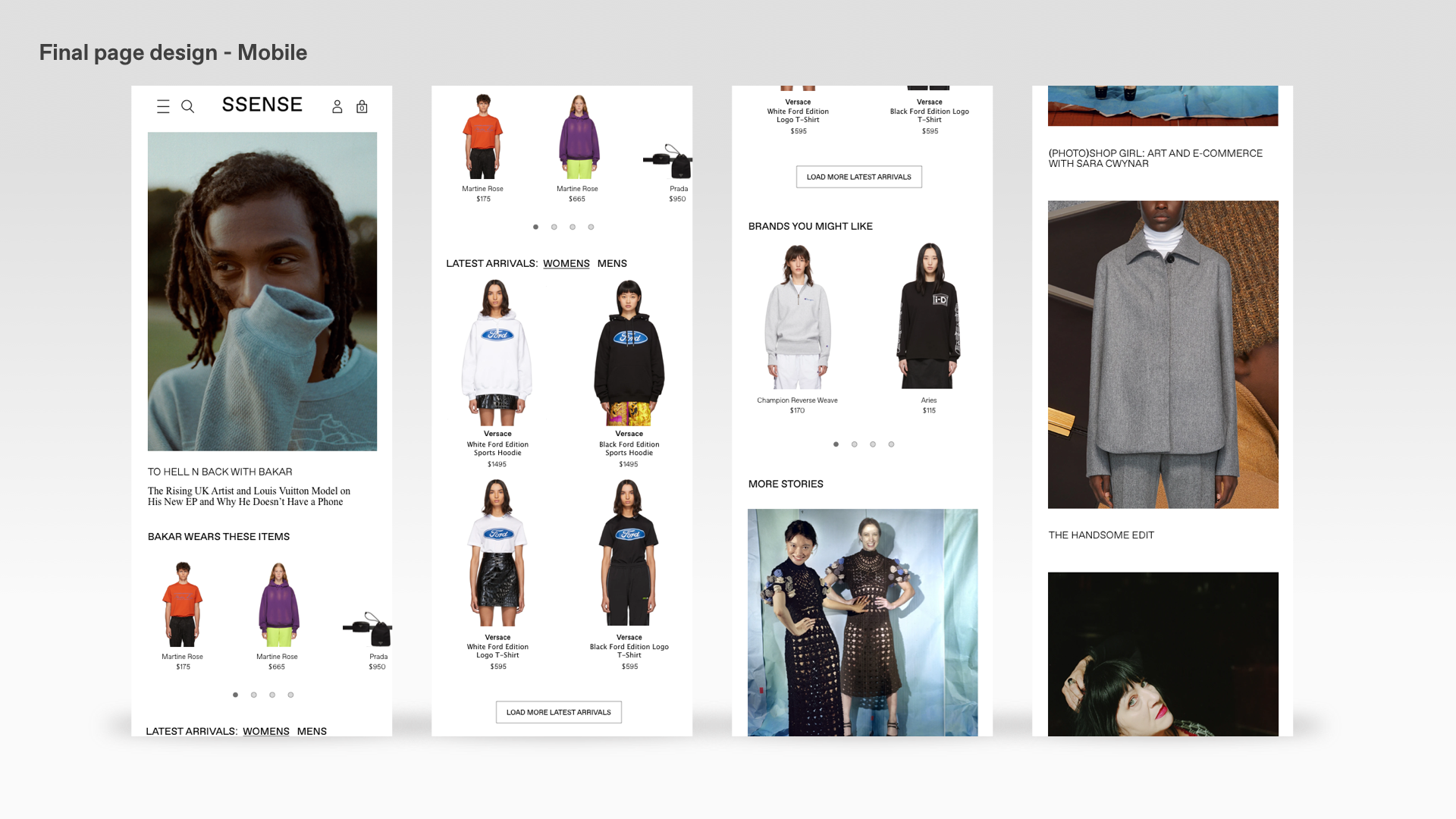
Final Results
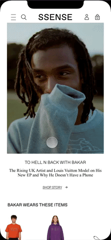
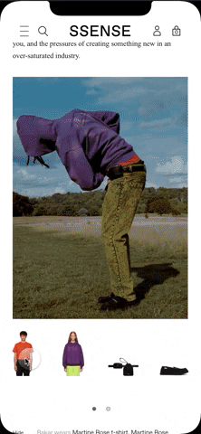
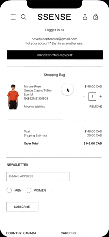
Adjustments were made to the call to action by adding “Shop Story.” This takes the user to the story article where the can view items and discover details of the product and have the ability to add items into their bag without leaving the editorial experience.
Adjustments were made to the call to action by adding “Shop Story.” This takes the user to the story article where the can view items and discover details of the product and have the ability to add items into their bag without leaving the editorial experience.
Final Submission
Micro-animations were created in a day to display the interactions of the experience. Full prototype available upon request.
Micro-animations were created in a day to display the interactions of the experience. Full prototype available upon request.
Key Learnings
When I presented my first submission to the SSENSE team, I followed up, by asking for direct feedback. As a direct response the team wanted to see a completed immersive experience with micro-animations and demonstrating an end-to-end user journey.
I felt my initial submission was not the best representation of my work ethics or capabilities, so I took another day to complete the journey by referring to my original sketches and building an in-depth prototype with micro-animations.
The team was impressed and put me forward into the next round of interviews with the tech lead and product lead, with a final in-person interview in Montreal, where I was hired me as a full-time UX Designer.